General
How the penci.ly Board Editor Works
A look at how the Penci.ly board editor works and how I am keeping the interface flexible without letting it become overwhelming.

6 min read
When I started building the Penci.ly board editor, one of my main goals was to keep it intentionally simple.
I am also the primary user of Penci.ly, so I am building the editor around something I personally want to use. One thing that has always bothered me about tools like Miro is how quickly the interface can become overwhelming. There are huge menus, dozens of tools, multiple toolbars, and features that I might never touch.
I do not want Penci.ly to become that.
The board editor is supposed to give you enough tools to organize ideas visually without making you learn a complicated design application first. That principle has influenced almost every part of the interface.
A Very Simple Interface
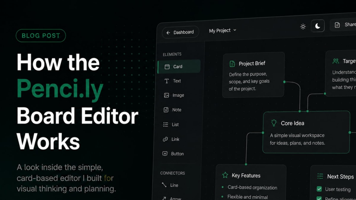
The top bar is deliberately small.
Right now, it contains basic controls for things such as sharing a board with other users, switching between light and dark mode, and eventually exporting boards to PDF, which is still a work in progress.
Dark mode is my favorite and is also the main visual direction of the Penci.ly website, but I still wanted the board editor to have a light mode. Some people simply find light workspaces more comfortable, especially when working during the day or when a board contains a lot of text.
Other than that, I am trying not to fill the top bar with buttons just because there is space available.
The sidebar is where most of the important tools live. The card tool sits at the top because cards are the foundation of the editor, while connectors sit at the bottom. Everything else is placed between them.
The range of elements is gradually expanding, but I am trying to be careful about how quickly that happens.
Before adding a new element, I usually spend some time thinking about what people would actually use it for and whether it adds something that the existing elements cannot already do. Even after I add something, there is no guarantee that it will stay forever.
That is part of why Penci.ly is still in pre-alpha. This stage gives me room to experiment, remove things, redesign them, or completely disable features if they turn out not to be useful.
The Board Itself
Most of the screen is simply the board.
That sounds obvious, but it took quite a lot of work to get to the point where the board actually feels good to use. I wanted dragging and placing things to feel immediate rather than like you are fighting the interface.
Adding a card is just a drag-and-drop interaction from the sidebar onto the board. Adding an element to a card works in the same way. You drag the element you want and drop it into the card.
It is a very simple interaction, but getting it to feel smooth and reliable took more work than I expected.
Cards can be placed anywhere on the board and resized freely. They can also be connected to other cards, which makes it possible to build mind maps, relationships between ideas, project structures, or whatever other layout makes sense for the board.
I am also working on snap placement and alignment. It is not completely finished yet, but it already works fairly well. The goal is to make it easy to build neatly aligned layouts without forcing users into a grid.
If someone wants a very structured board, they should be able to build one. If they prefer something more free-form, the editor should not get in their way.
Why Everything Lives Inside Cards
I was actually skeptical about the card-based approach at first.
During development, I experimented with allowing elements such as text and images to sit directly on the board itself. On paper, that sounded more flexible because users could place absolutely anything anywhere.
In practice, I did not like it.
Once several elements were on the board, everything started to become crowded. Text, images, buttons, links, and other elements were competing for space, and the board gradually started feeling like the kind of complicated canvas I was trying to avoid in the first place.
It also made the main idea behind Penci.ly less clear.
So I went back to cards.
Now, elements live inside cards, while cards are what users actually arrange on the board. That small restriction makes the entire workspace much easier to understand because every group of information has a clear boundary.
The cards themselves do not have to look heavy, either. A card can have a title and an icon if you want it to, but both are optional. If you just want a minimal image card or a small piece of text sitting on the board, you can keep the card almost invisible.
That balance has become one of the main ideas behind the editor. Cards provide structure, but they should not constantly remind you that they are there.
Editing the Content
Once an element is inside a card, there are still plenty of options for editing it.
Text elements can have different styles and formatting options. Images have their own settings, and lists and other elements have controls specific to the type of content they contain.
This is another area where I am trying to separate complexity from clutter.
I do want individual elements to have enough settings to be useful, but I do not want all of those settings permanently visible around the board. The workspace itself should remain simple, while more detailed controls only appear when you are actually editing something.
That way, the editor can still support fairly detailed boards without constantly showing every possible option at once.
Keeping Penci.ly Small on Purpose
I think one of the easiest mistakes I could make with Penci.ly would be to keep adding features until the editor eventually becomes the exact kind of tool I wanted to avoid.
There will definitely be more elements, more card options, better connectors, improved alignment tools, and plenty of smaller improvements as development continues.
The difference is that I want each of those additions to justify its place in the editor.
The pre-alpha phase is especially useful for that because I can test ideas without pretending that every feature is permanent. Some will work, some will need to be redesigned, and some will probably disappear completely.
The direction I am aiming for is becoming much clearer, though. Penci.ly should feel like a board you can open and immediately understand, while still giving you enough flexibility to build something complex once you start using it.
For me, that is much more useful than having hundreds of features available from the first minute.
What is one feature you think a visual board absolutely needs, and one that you think usually makes these tools unnecessarily complicated?